More than half of all web traffic today comes from smartphones. That means if your website isn’t mobile-friendly, you’re losing visitors and potential customers. A mobile-friendly website is one that looks great, loads fast, and is easy to use on any screen size.
Here’s how you can design one:
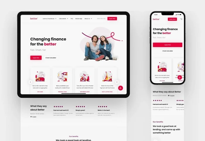
1. Use a Responsive Design
•Choose a website theme or template that automatically adjusts to different screen sizes.
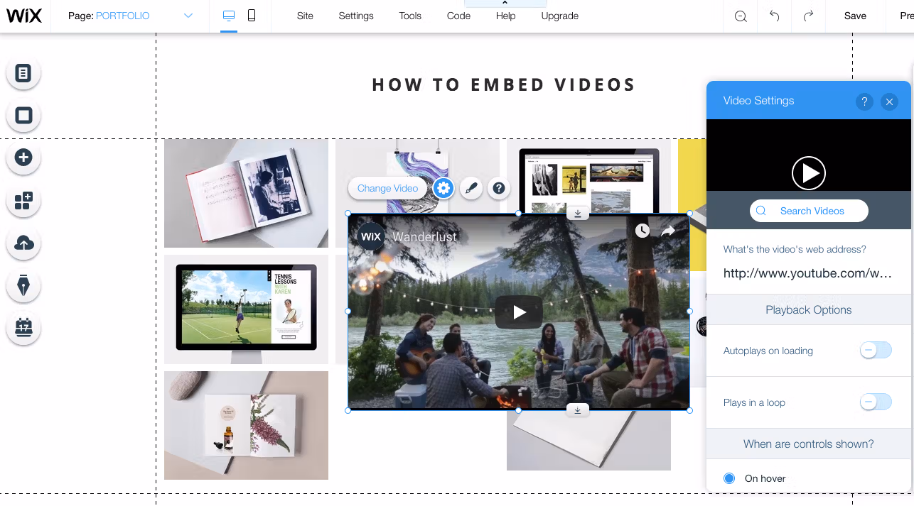
•Most modern builders like WordPress, Wix, or Shopify already provide responsive themes.
2. Keep Navigation Simple
•Use a clean menu with just the essential pages.
•Add a “hamburger menu” (three-line menu icon) for easy navigation on smaller screens.
•Make buttons large enough to tap without zooming.
3. Optimize Your Content for Small Screens
•Use short paragraphs and bullet points for readability.
•Break text into sections with headings.
•Avoid tiny fonts use at least 14–16px.
4. Use Mobile Friendly Images & Media
•Compress images so they load quickly without losing quality.
•Use formats like JPEG or WebP for faster performance.
•Make sure videos scale properly on small screens.
5. Improve Loading Speed
•Use a fast hosting provider.
•Minimize heavy scripts and plugins.
•Enable browser caching and use a content delivery network (CDN).
6. Test Across Devices
•Check how your site looks on different phones and tablets.
•Use free tools like Google Mobile-Friendly Test to spot issues.
Final Thought
A mobile friendly website improves user experience, keeps visitors on your page longer, and even boosts your search engine ranking. In today’s digital world, it’s not optional it’s a must.